Greener
October 2025–January 2026
Minimizing negative perceptions about sustainable eating with flexible and budget friendly grocery suggestions.

Scope:
Concept Development
UX research
Design
Prototyping
Vibecoding
Context:
Mobile app
Nutrition
Sustainability
Problem
Sustainability and nutrition are seen as expensive, time consuming, and overwhelming.
91% of users report feeling guilt around their food habits.
Making better choices feels like a luxury when budgets and schedules are already at their limit, and navigating conversations around food habits often demands too much from people who are already stretched thin.
Goal Statement
Give people a way to do just a little better within their real circumstances, and make that feel worth celebrating.

Outcome
A mobile app that helps users make small, budget-conscious swaps in their grocery choices, showing the compounded impact of those swaps over time without pressure, guilt, or the need to be perfect.
72% of users stated interest following initial demo, with 85% stating special interest in personalized product suggestions.
Discover
Gotta eat to live, gotta live to eat
Research shows that above all else, people are doing what they know to be the best they can.
They're tired, and the framing of these conversations treat socioeconomic realities and cultural perception as a choice or personal shortcoming.
Literature review
A comprehensive literature review on nutrition and food sustainability revealed three consistent themes.
These would serve as the foundation of all design decisions moving forward.
Research Findings

User validation
How does the average person think about sustainable eating?
I ran two surveys across 92 total respondents.
Alongside this were four in-depth expert interviews with academics, nutritionists, and community sustainability organizations.
Core pain points
The research revealed my core goals for the product.
Defining the user
The user persona placed what I'd discovered into context and define the core goals moving into ideation.

Sam, 26
Full-time student + full-time job
"I know I should eat better and be more conscious about it. But by the time I'm done with everything, I just grab whatever's there."
I don't have the time or energy to figure out what the 'right' choice even is."
Goals
Convenient meals that don't require major sacrifice
Sustainable habit that make sense for him
Save money without giving up time
Choose the best options when access is limited
Celebrate small wins
Pain Points
Strict budget makes sustainable options feel inaccessible.
Guilt when convenience wins.
Juggling multiple apps that each only solve a singular need
Generic tips that don't account for his budget or schedule
No way to compare options quickly when he's out
People already want to do better, I need to make it easy
Why current apps don't solve it
Nutrition apps alone can only solve part of the problem. Many of these tools only address one part of the problem, or just add more tracking, more judgment, and more opportunity to fail.
market sentiments
40% of users who had previously used a nutrition app stopped due to loss of interest or relevance.


Competitive analysis to identify target market gaps
Design principles
Based on the research, I set 3 principles for every layer of the design.
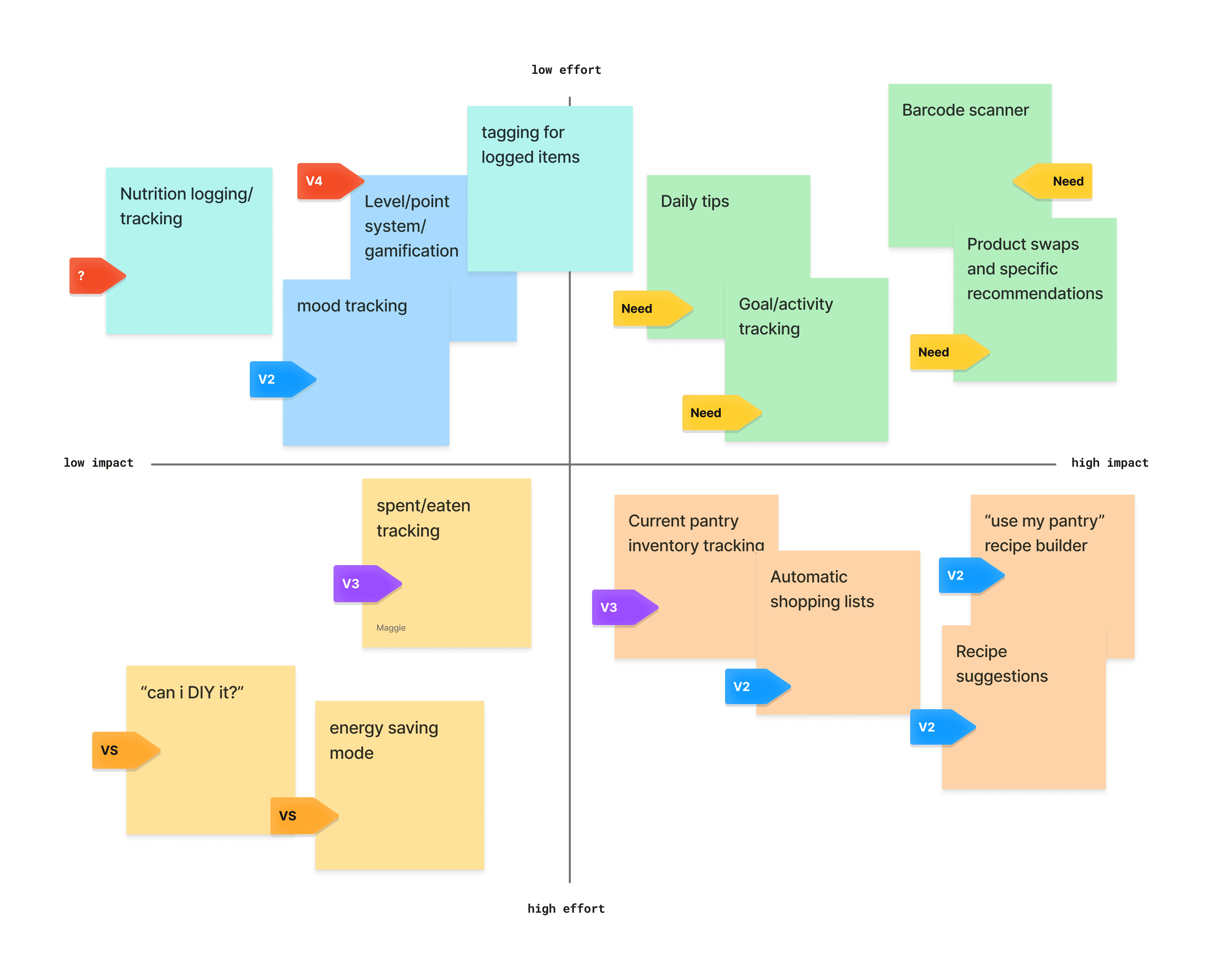
Key features
A prioritization grid determined my MVP features:
Interaction Flows

Design
Not perfect, just greener
A system of features designed around real life, not ideal conditions
Greener addresses the most common barriers within users' lives. Real-time comparisons, one-tap swaps, and a tone that treats any improvement as progress.
Low stakes, high impact
Onboarding
A short onboarding quiz collecting dietary preferences, monthly budget, and sustainability goals to power the personalization engine right off the bat.

Progress isn't linear
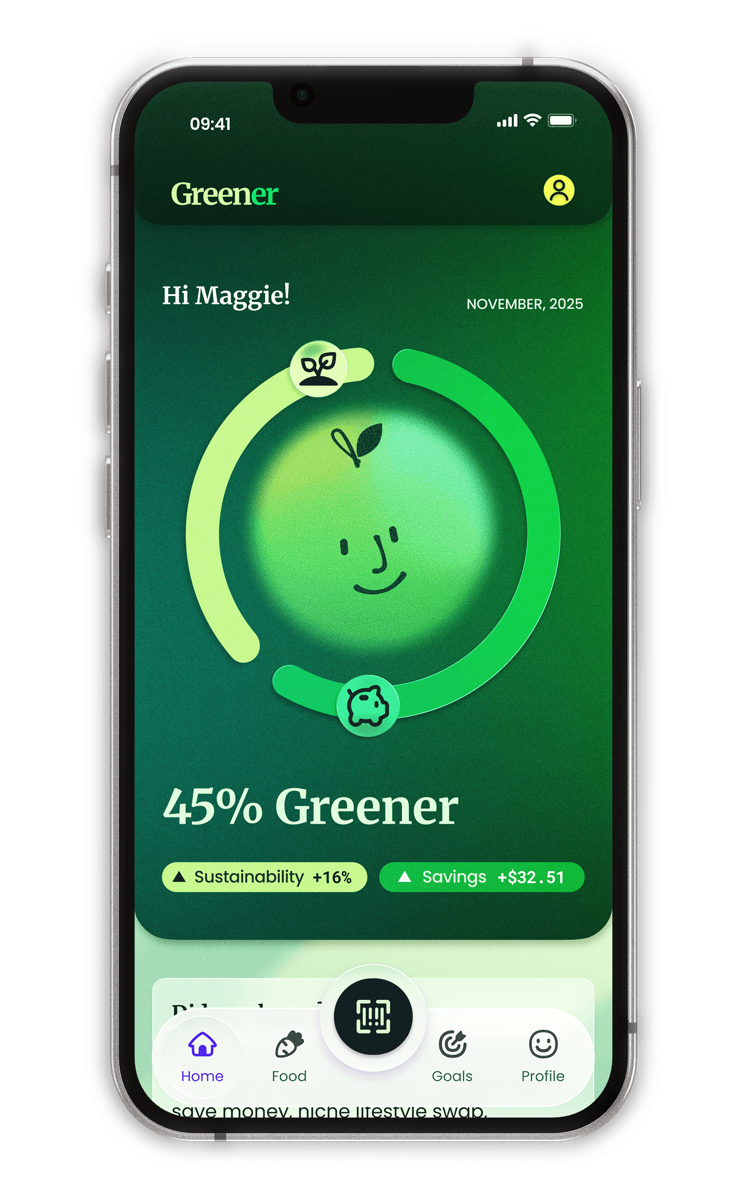
See your progress compound
A simple chart on the home screen frames every choice as movement toward being Greener.
Any swap improves your baseline. There's no floor to fail through.


flexibility and balance
Lists built for flexibility
Smart lists suggest swaps and alternatives, ranking similar product along a dynamic scale that balances users' budget and sustainability.
No option is wrong, you just pick what works best for you,


Convenience is crucial
Compromise doesn't mean giving up.
Scan and compare measures any two products side by side across sustainability, nutrition, and cost in order to help users still know their best options in limited selections.
Vibecoding
I was interested in testing the capabilities of AI tools that would allow me to make a more developed prototype and better understand the technical limitations of my goals.
I used Figma's MCP integration with Cursor to test how the scanner, list logic, and goal balancing would potentially function.
Impact
Outcome
Small choices compound
The product swaps and progress visualizations empower users to reach their goals while allowing for socioeconomic fluctuations and day-to-day inconsistencies to see real impact through small changes.